Numeracy: When it's not quite all there
For your consideration, two examples of falling short, literally, on the numbers.
Our first specimen:

Rule No. 1 (or 2, I forget) of infographics: If you use a pie chart, the percentages should add to 100 because people, seeing a circle, believe they are seeing the whole. You do the math ...
And then, just for fun, ponder this one:
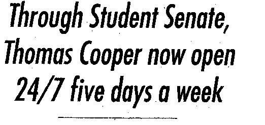
Need any more be said?
posted by Doug @ 7:06 PM
3 comments|
![]()
![]()


3 Comments:
Two observations:
-- This is evidence that the overused "24/7" has lost its meaning.
-- The colors and patterns in the pie chart make me queasy. And why isn't fried Coke on there?
My apologies for the greenish hue and some of the coloring. Blogger did that when I uploaded it. I suspect I left the original in CMYK insead of RGB. I'll try to redo. Having said that, however, the patterns still are a bit busy for easy understanding.
Doug
There, that's better. RGB wins the day again.
Post a Comment
<< Home